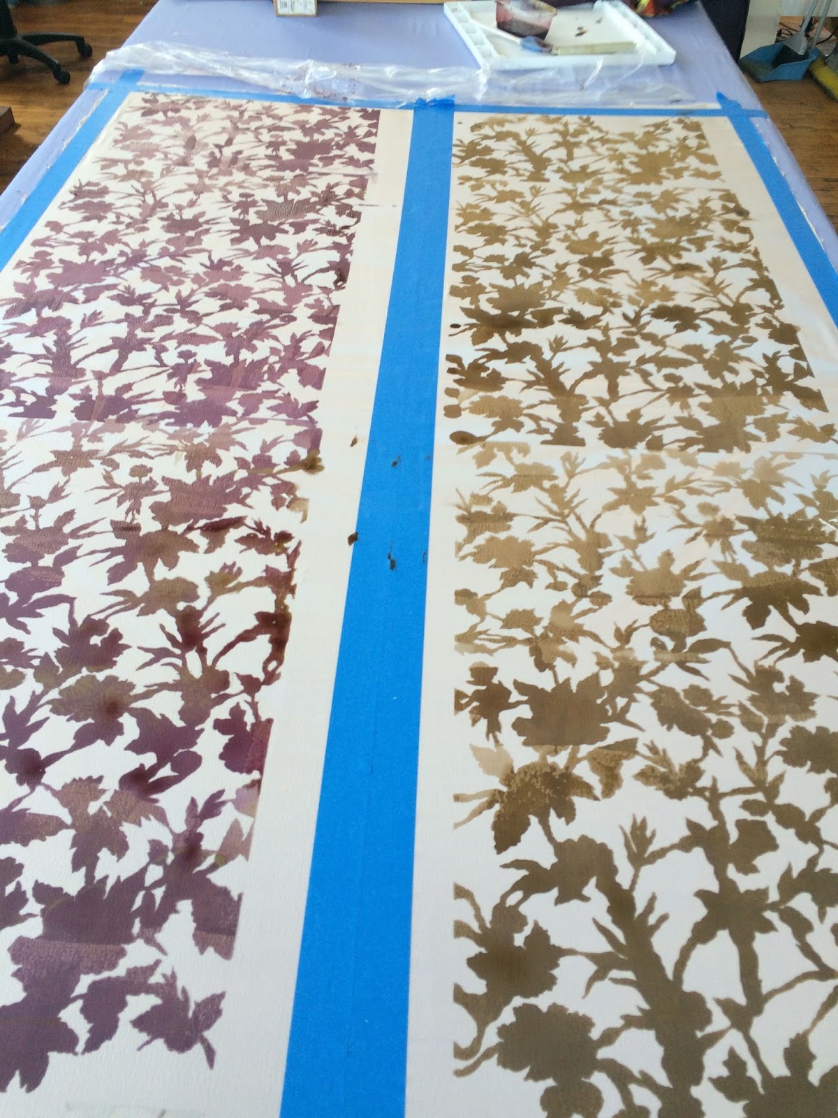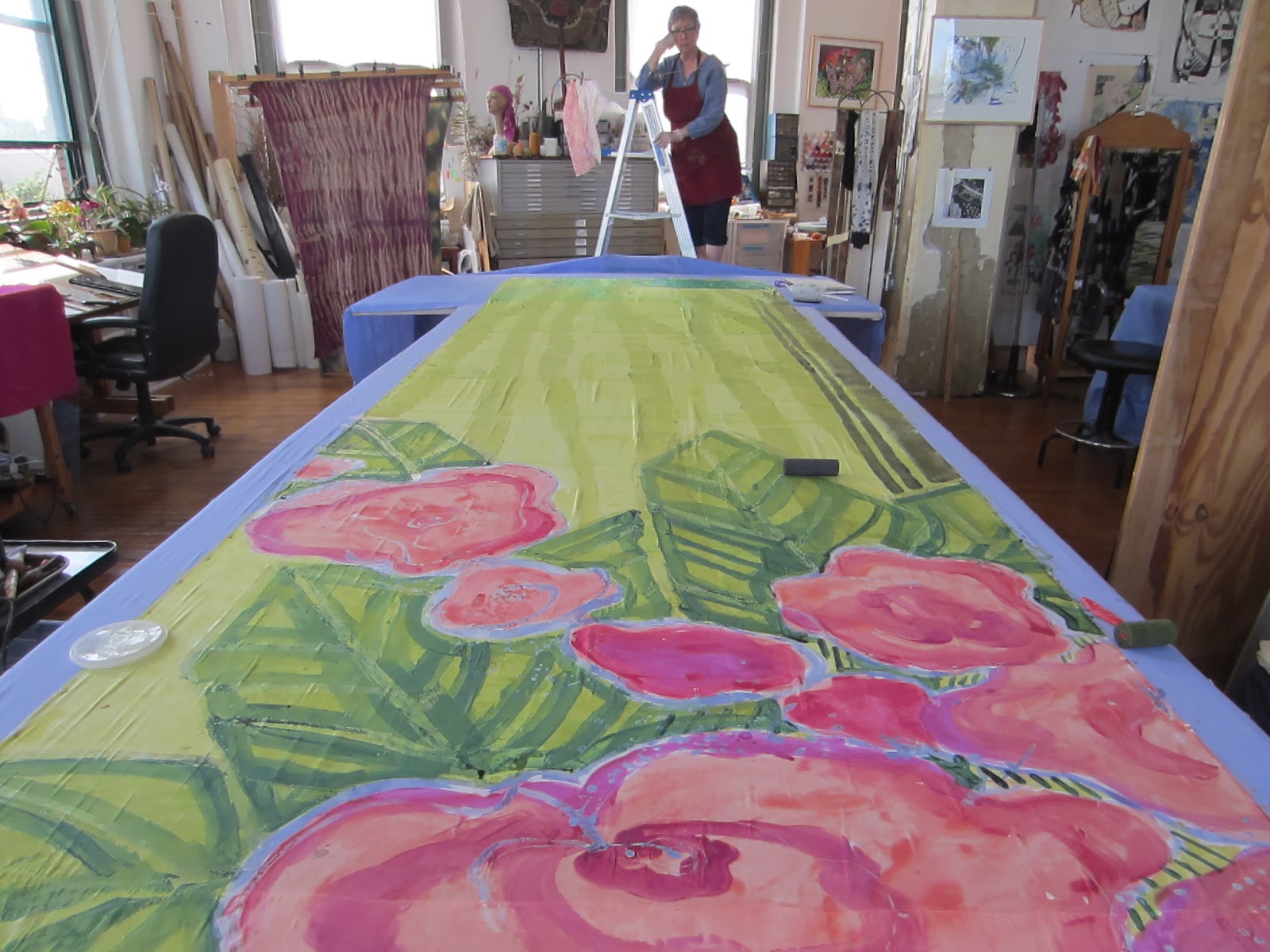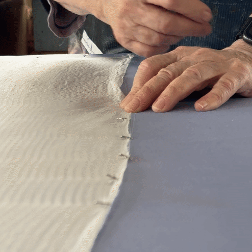
After cutting down and mordanting my fabric its time to stretch and pin the fabric on my padded studio table. The promise of new work is always alluring.
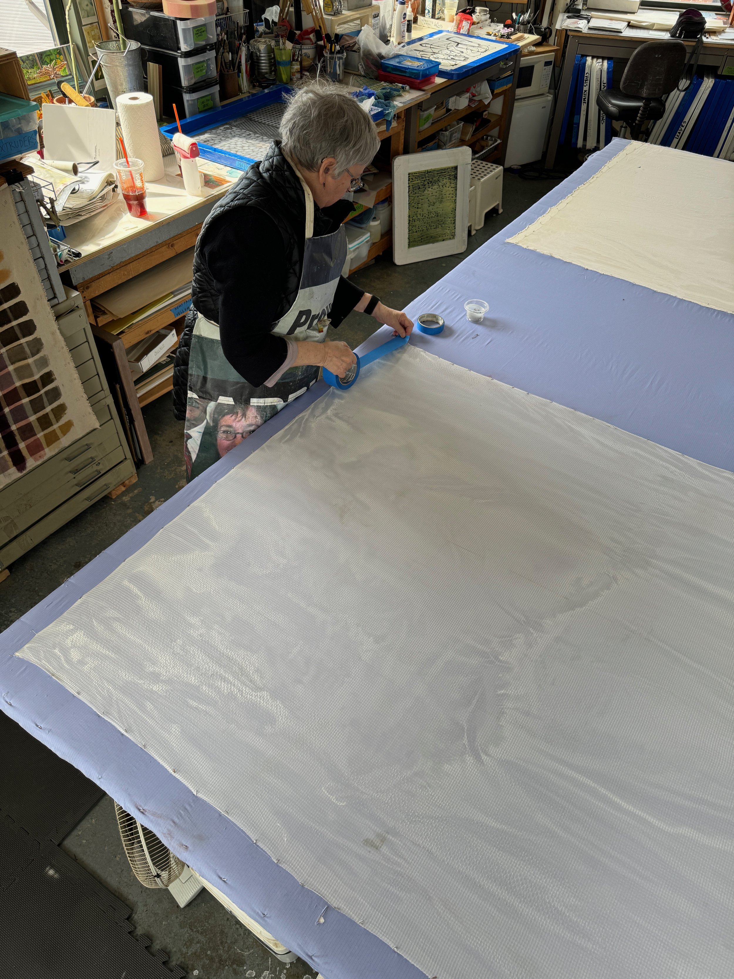
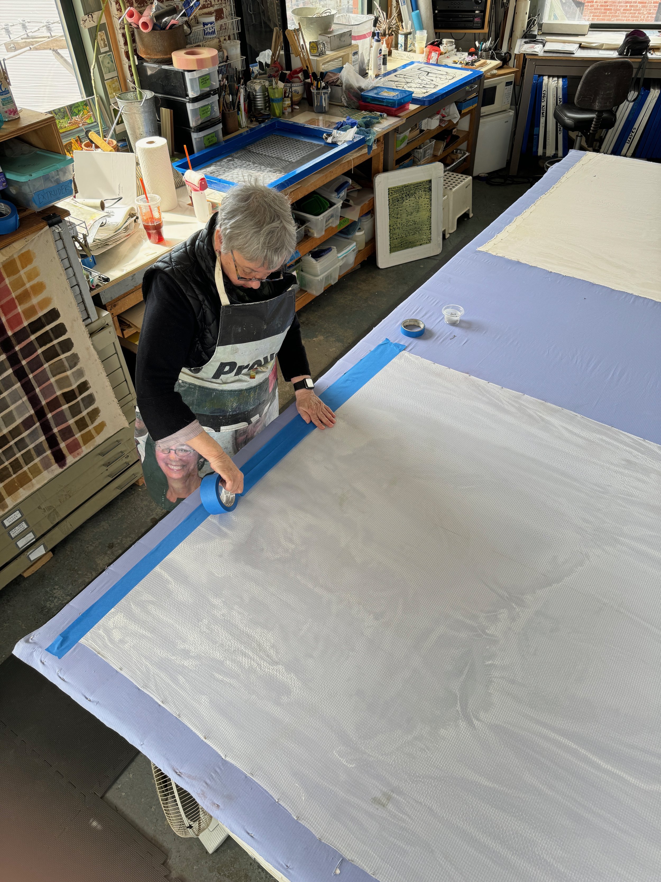
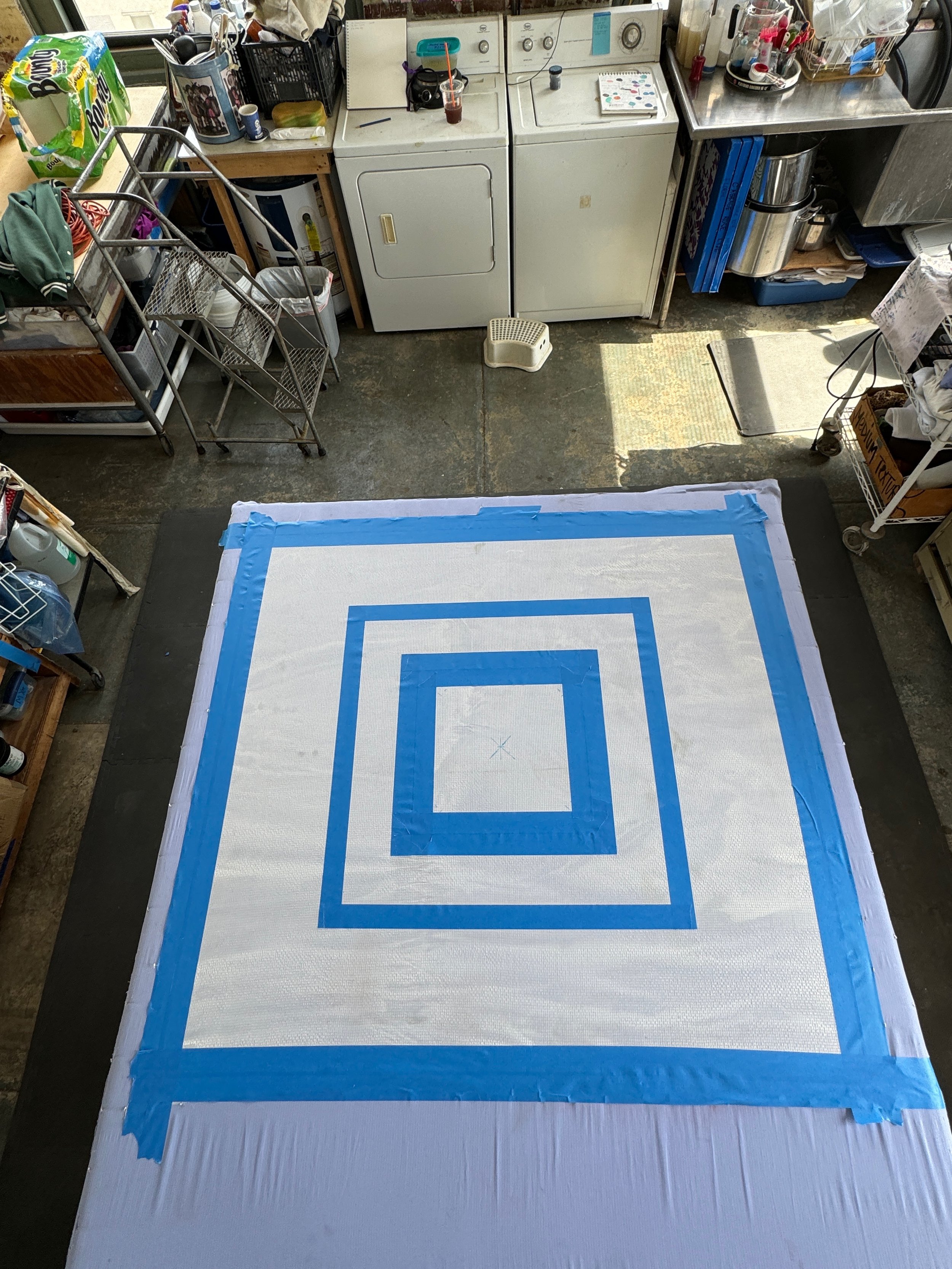
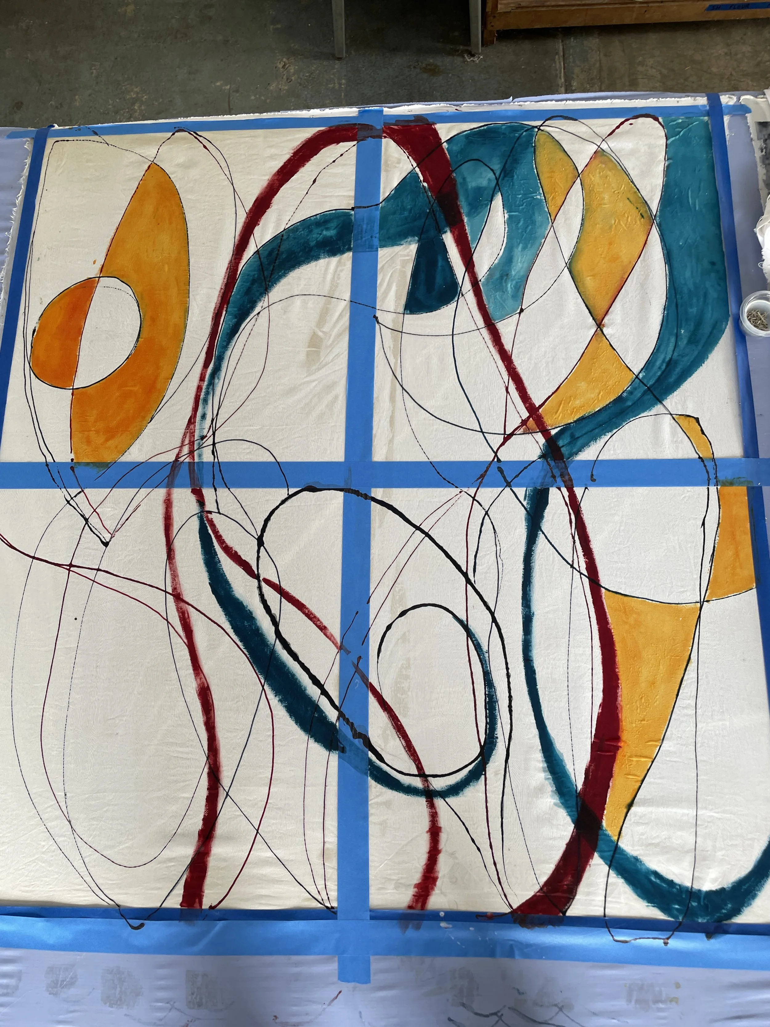
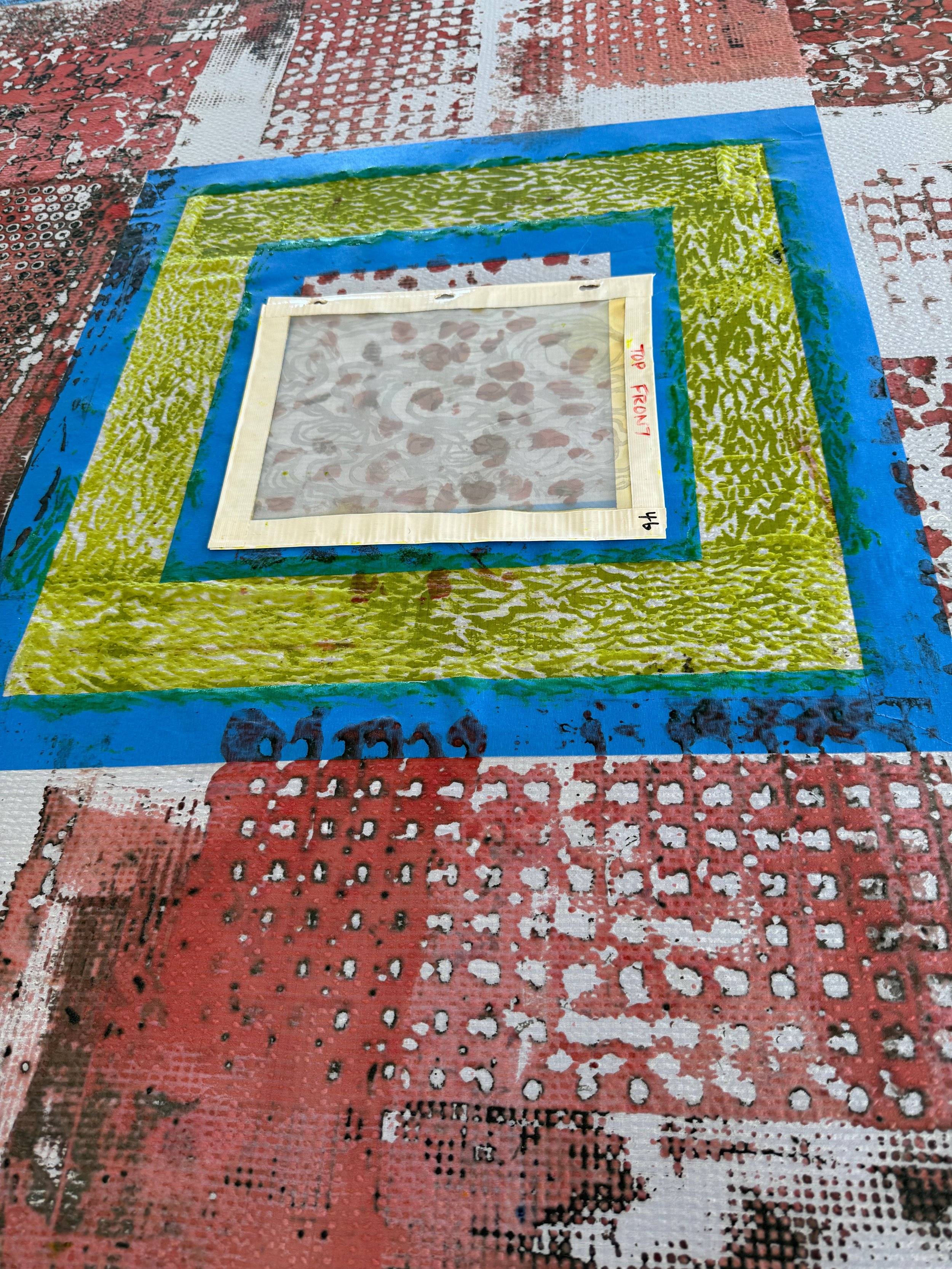
Tape serves multiple functions; compositional, and as a way to preserve whites to work with later.
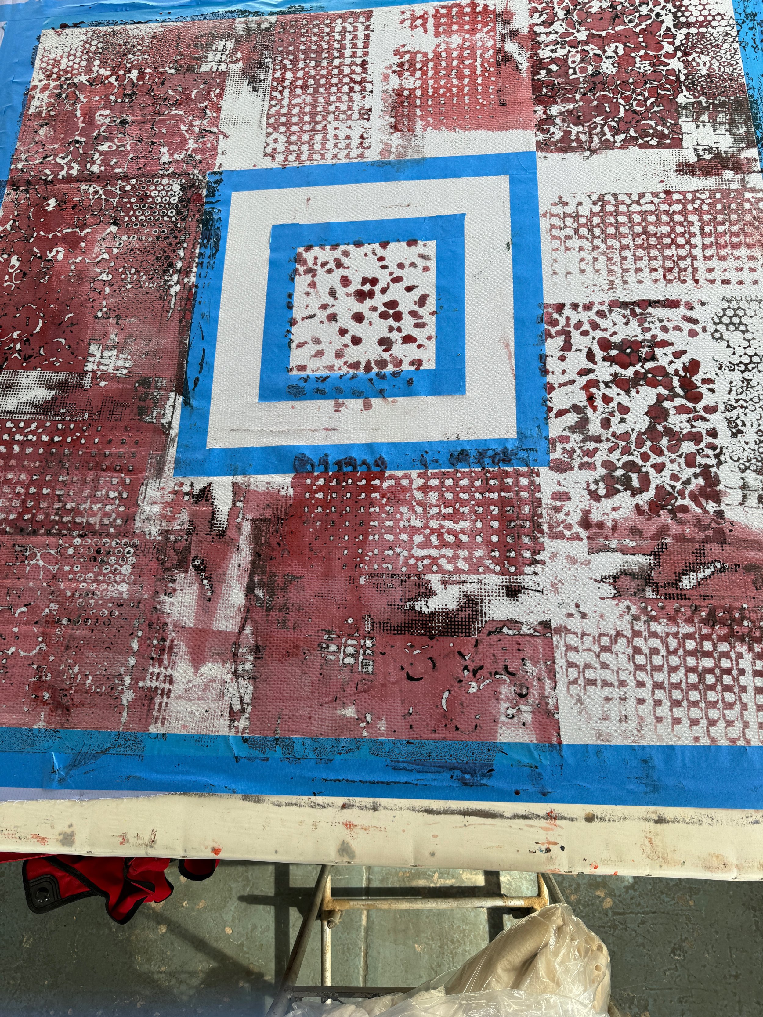
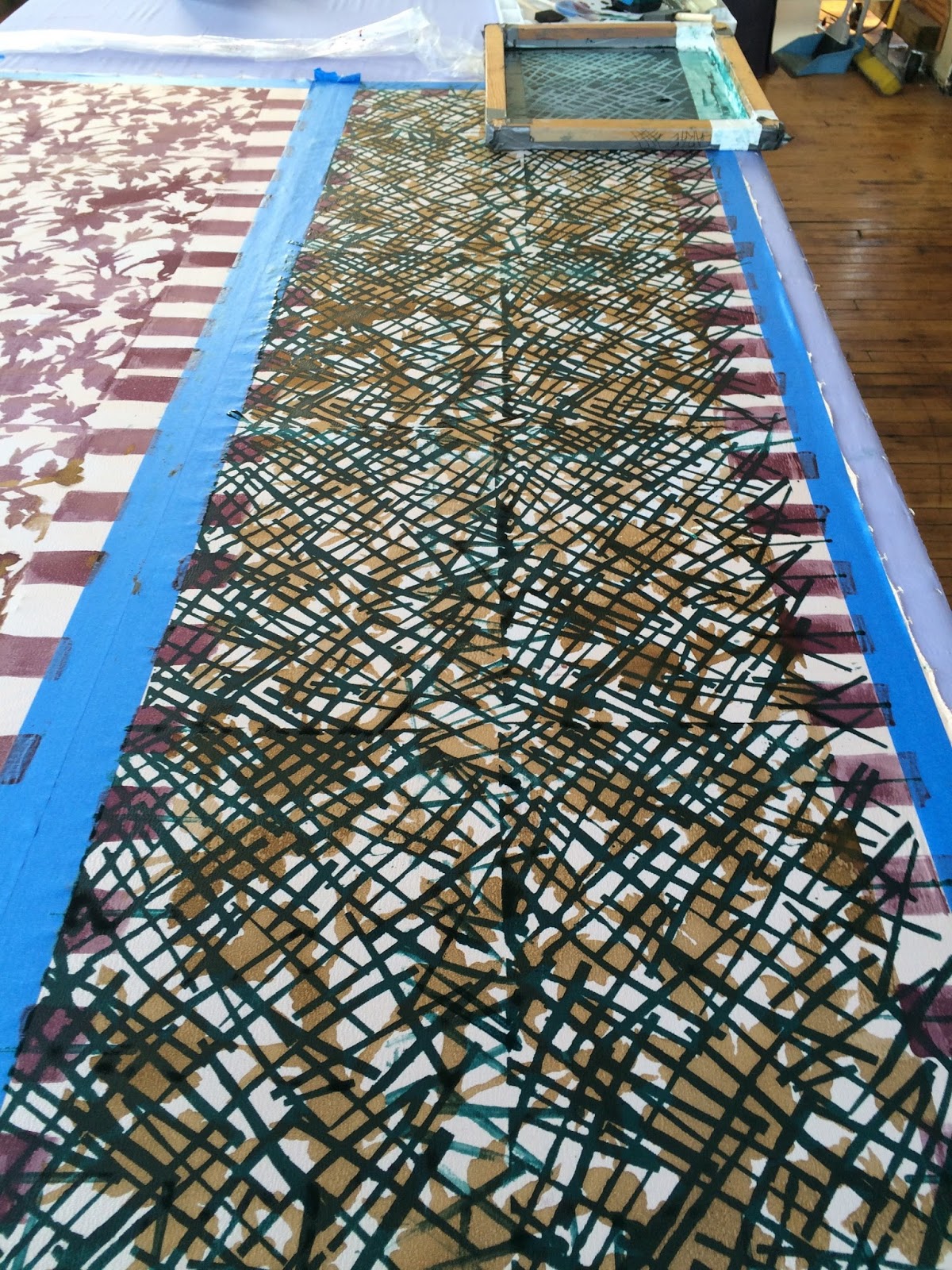
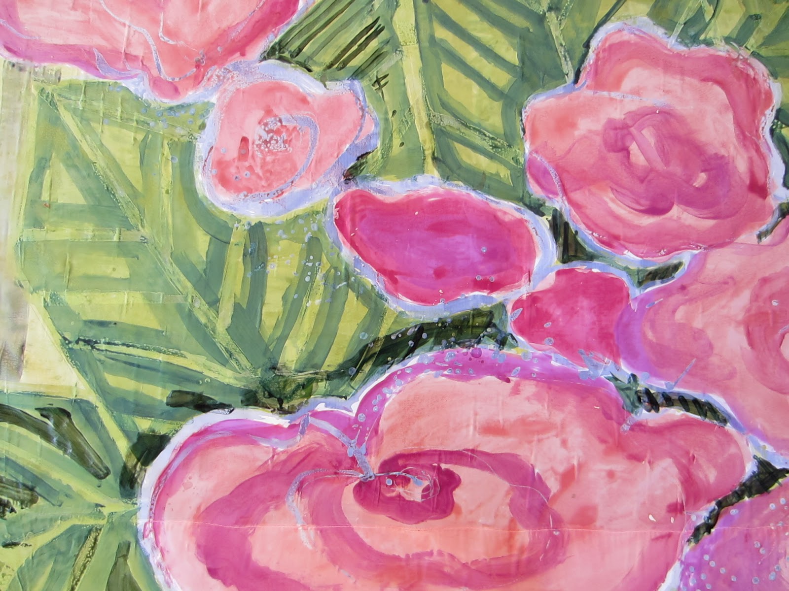
The first layers of Deconstructed Silk Screen printed.
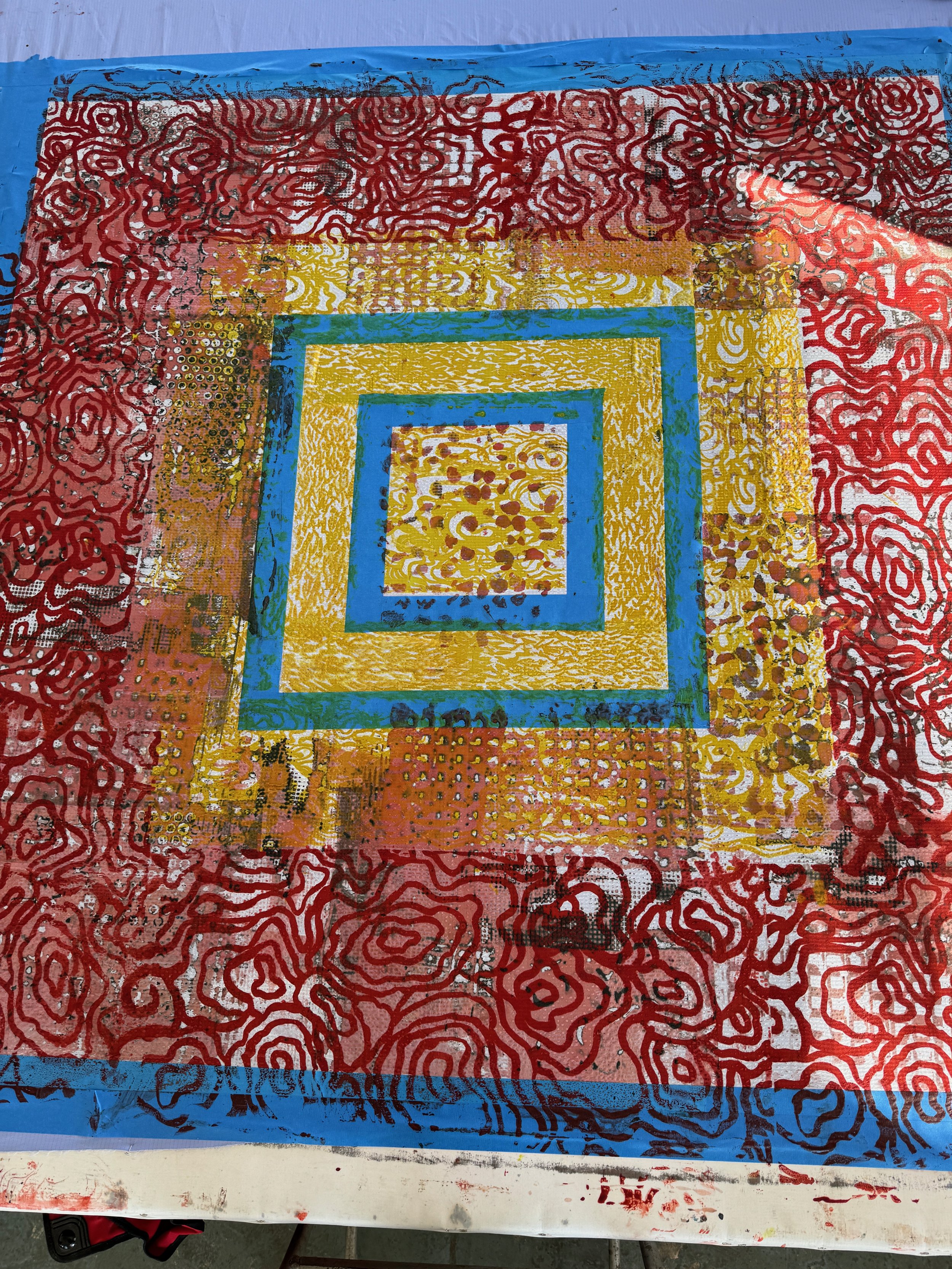
Adding more layers with thickened dye and custom made Thermofax patterns.

Mixing dye powder with print paste thickener.
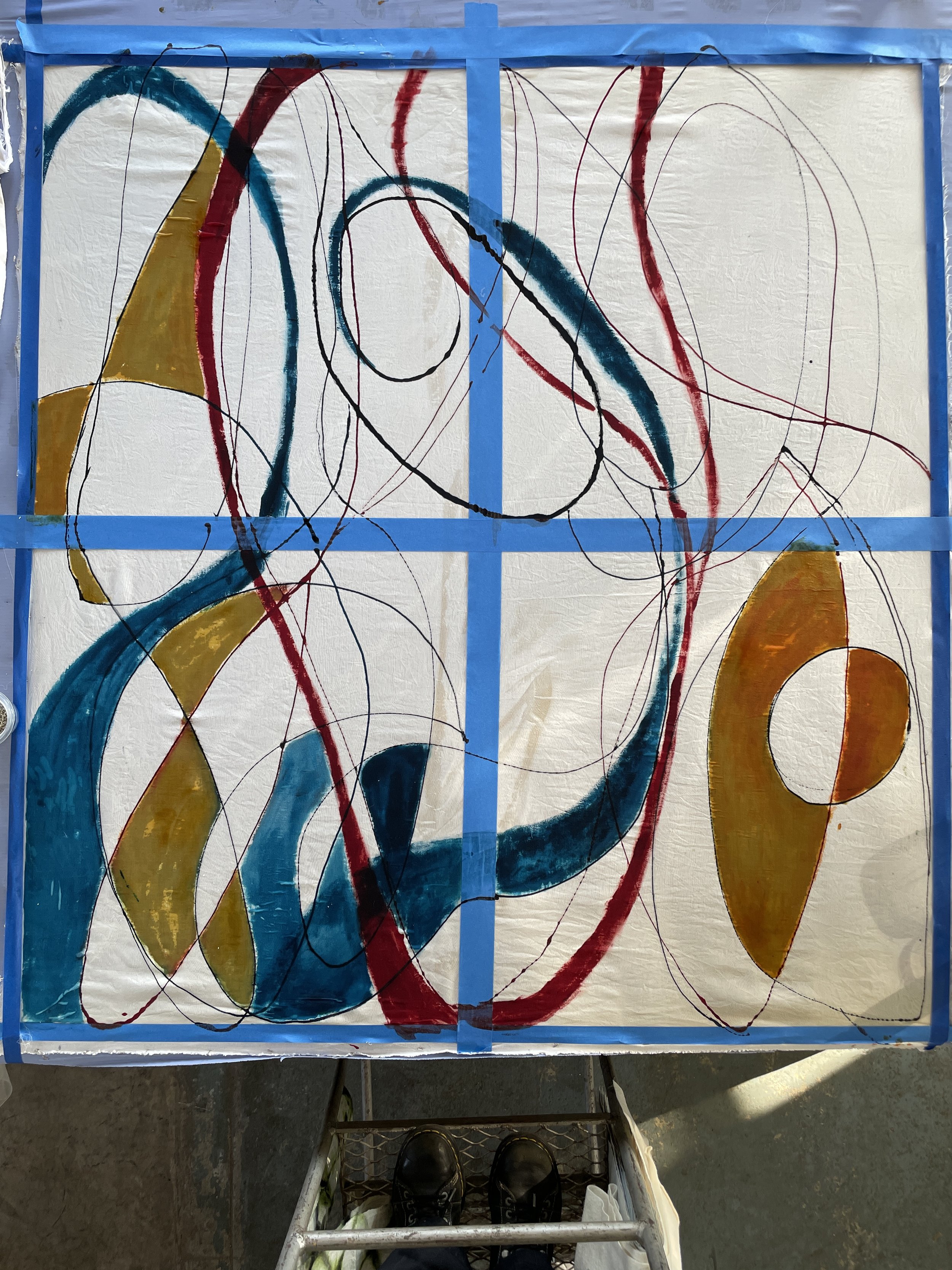
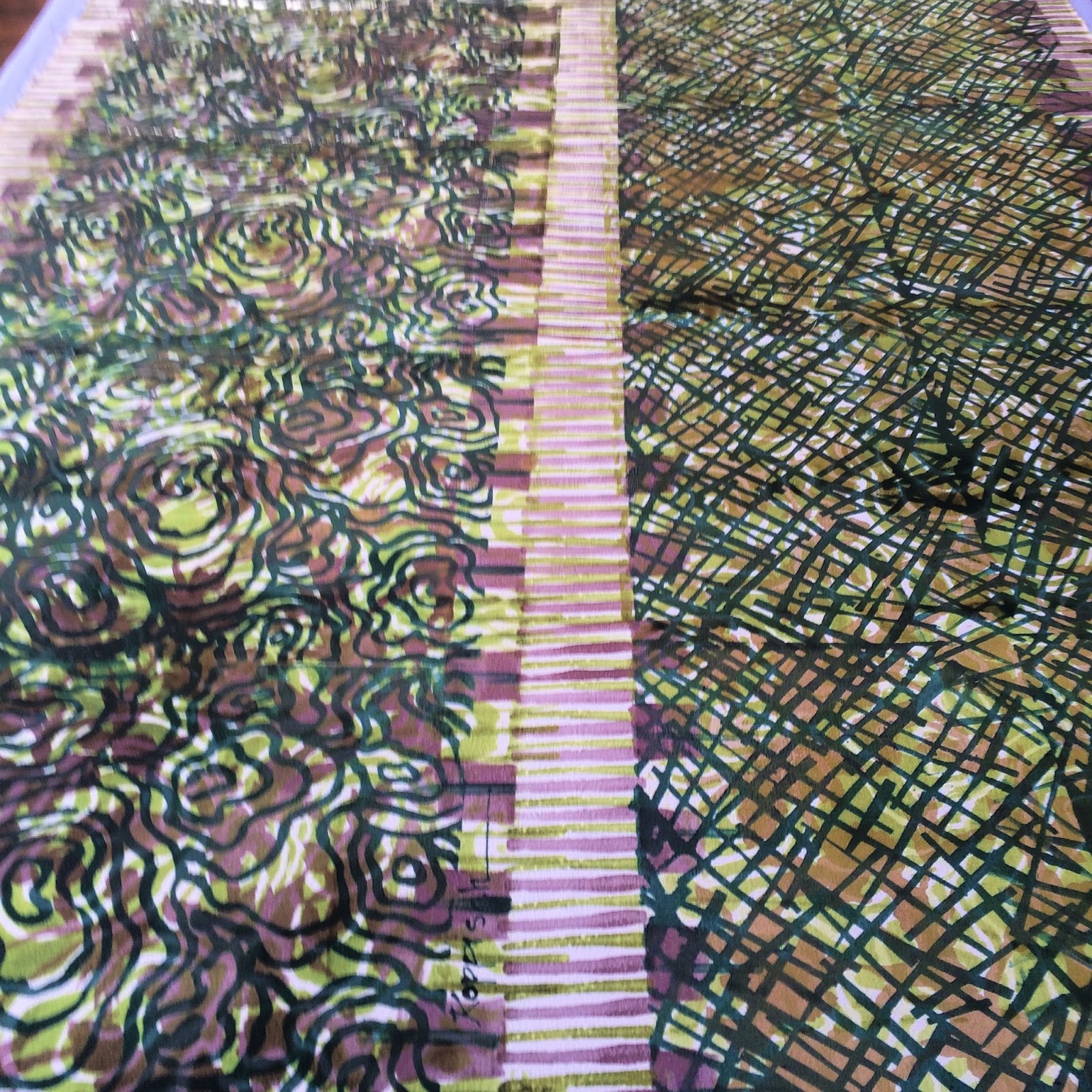
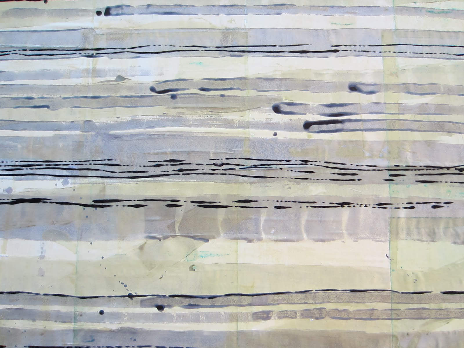
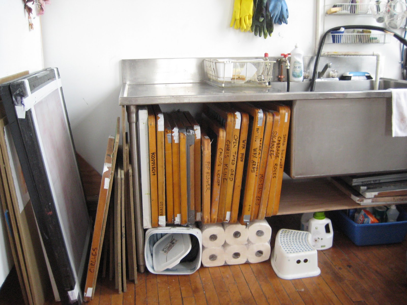
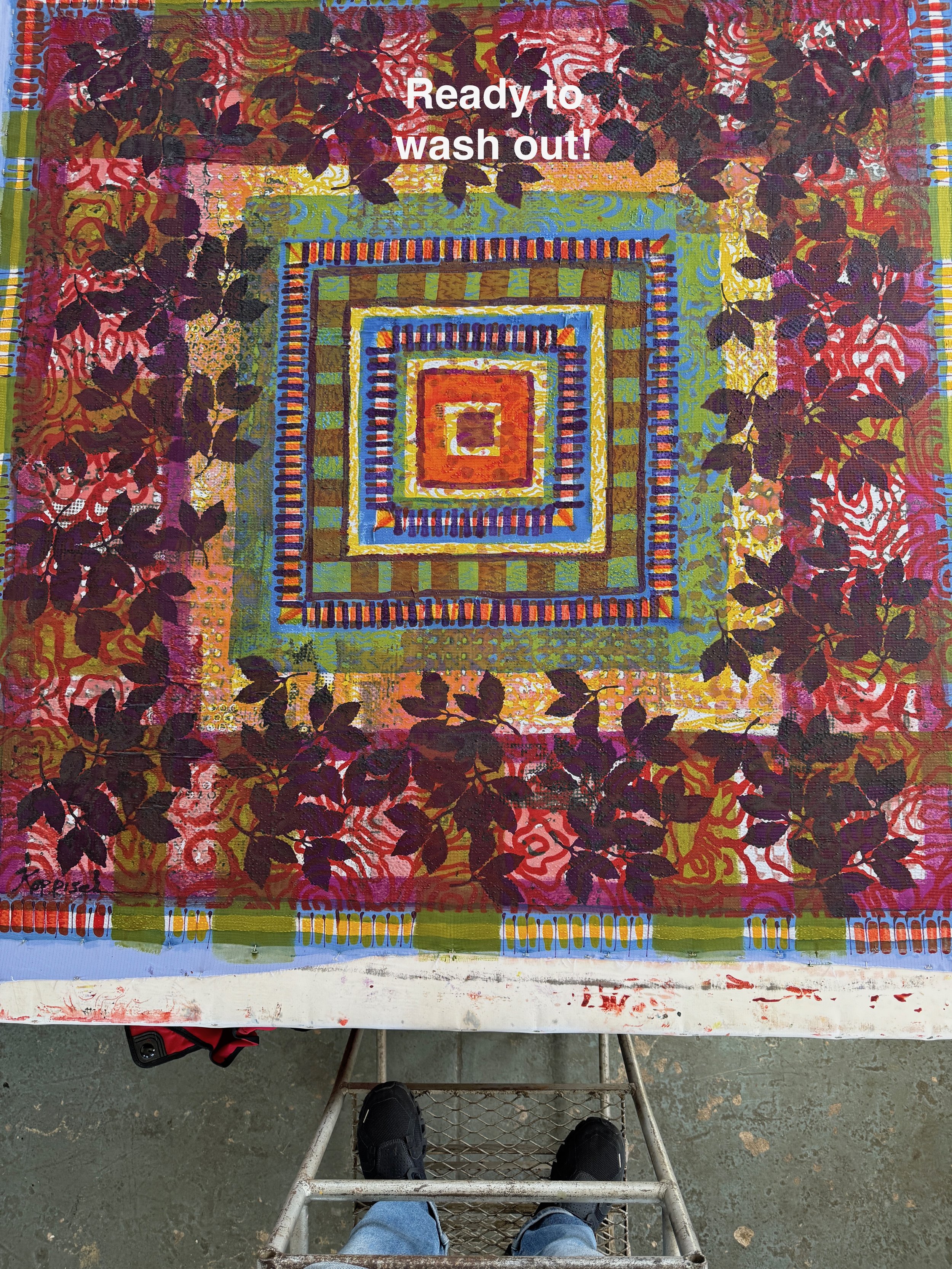
So far I’ve used 3 different silk screens to print with thickened dye. Now it’s time to take off the tape!

I felt inspired by the color of the blue tape so mixed up some blue dye and coming in with a roller!
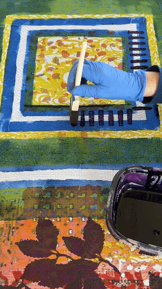
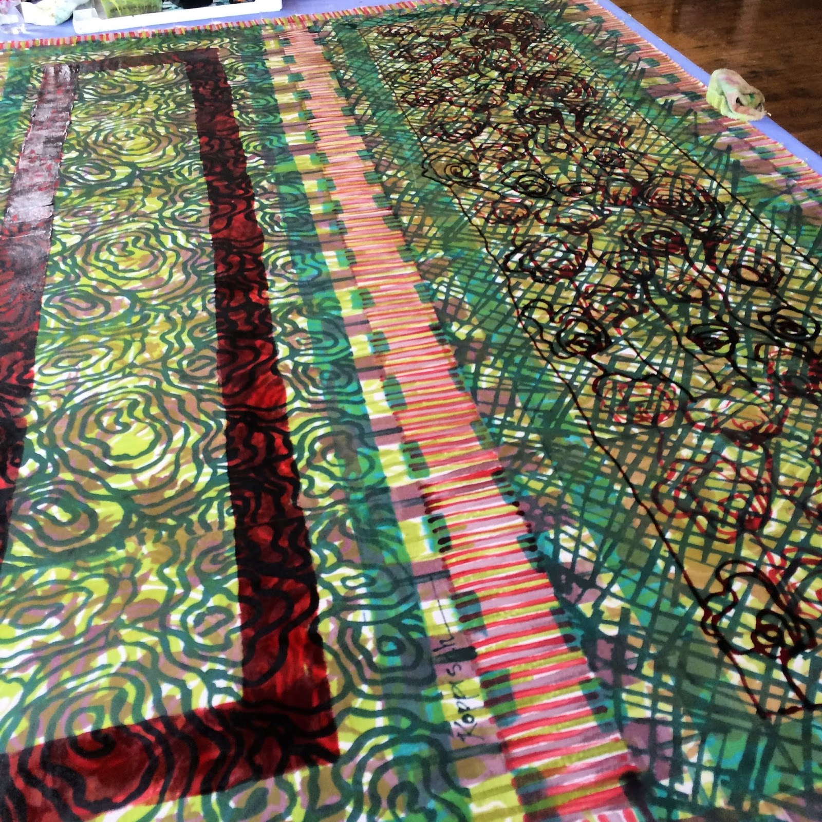
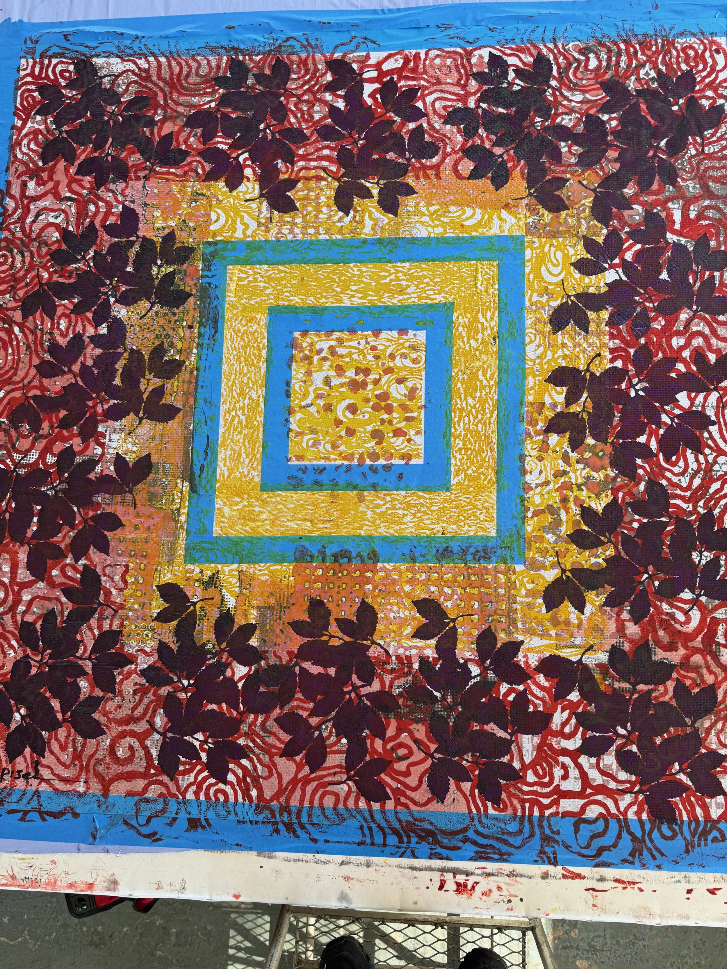
Adding some lines with thickened dye and a foam brush more to come later with my extruder.
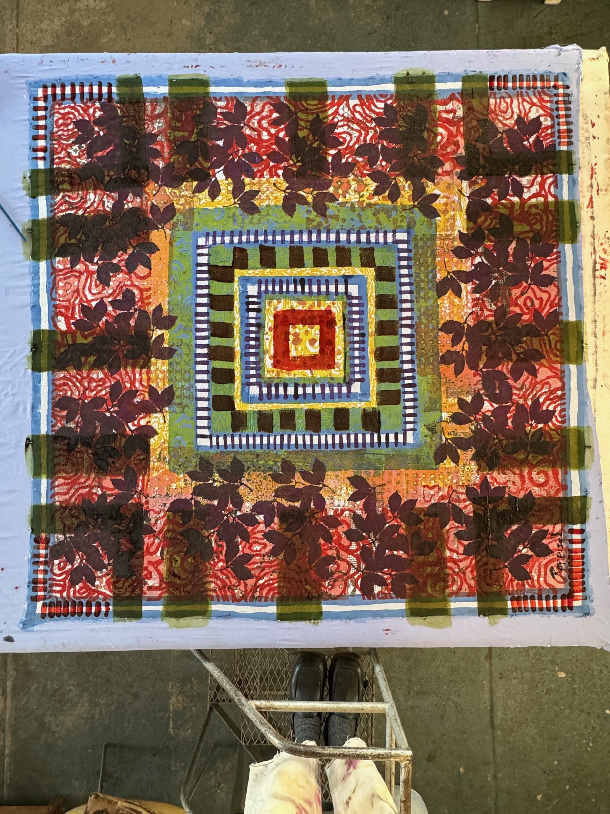
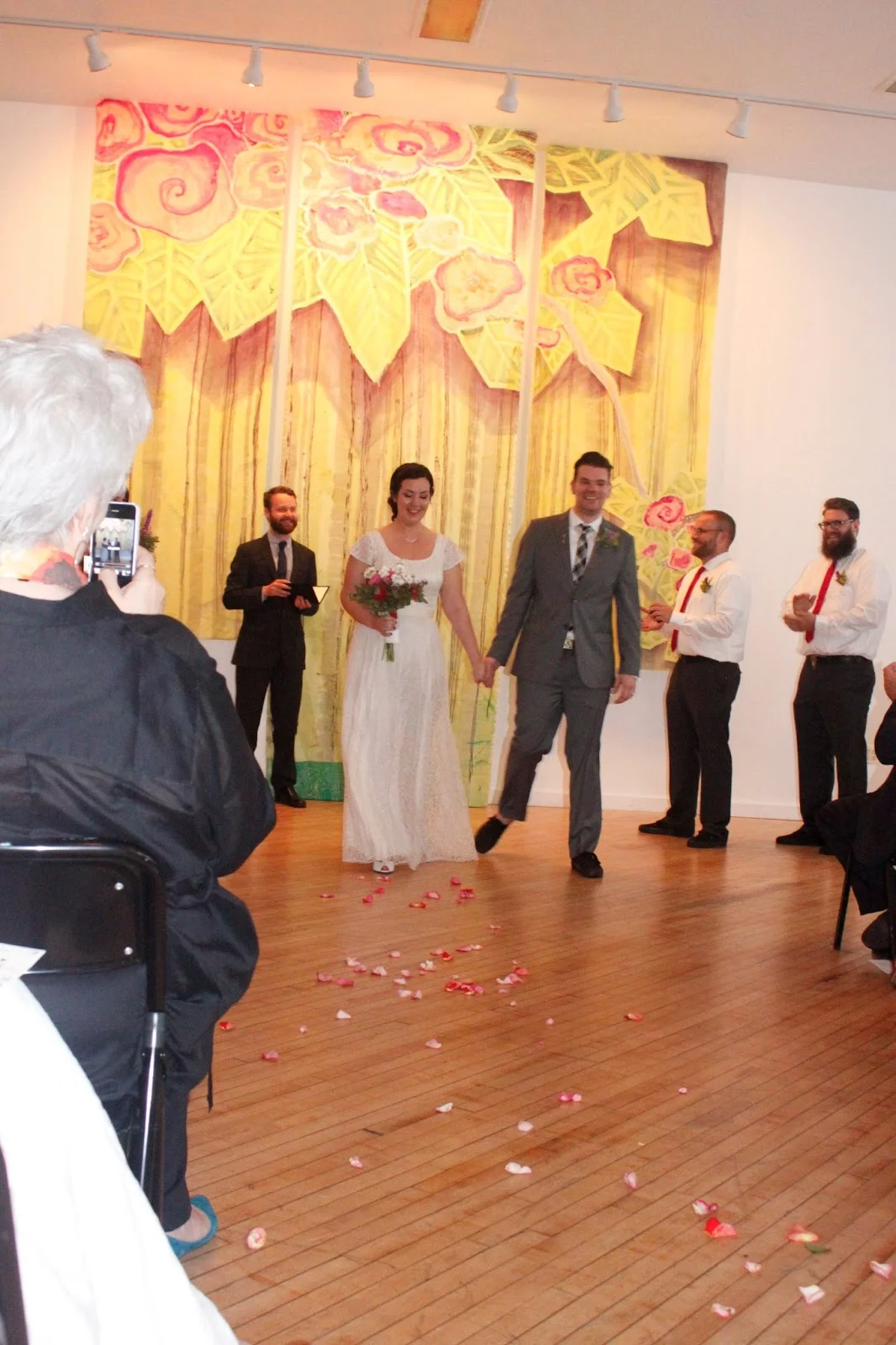
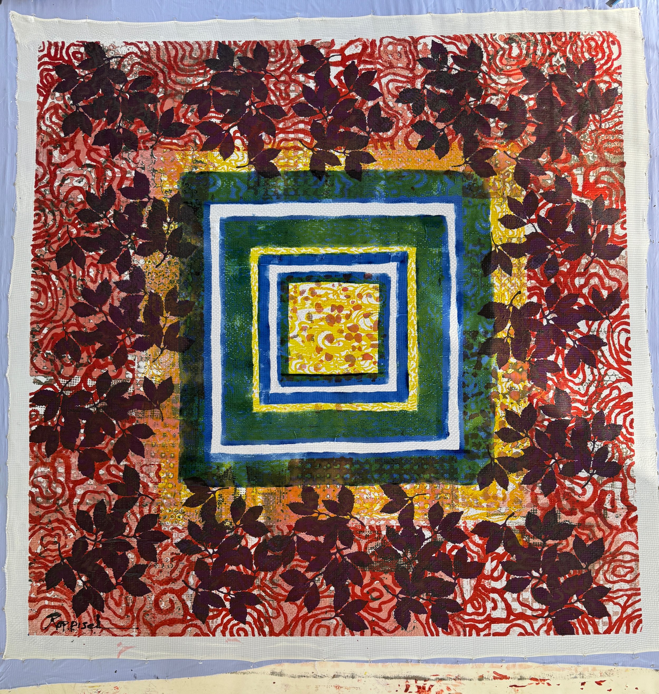
I think we could use a bit more from here but getting close to feeling finished.
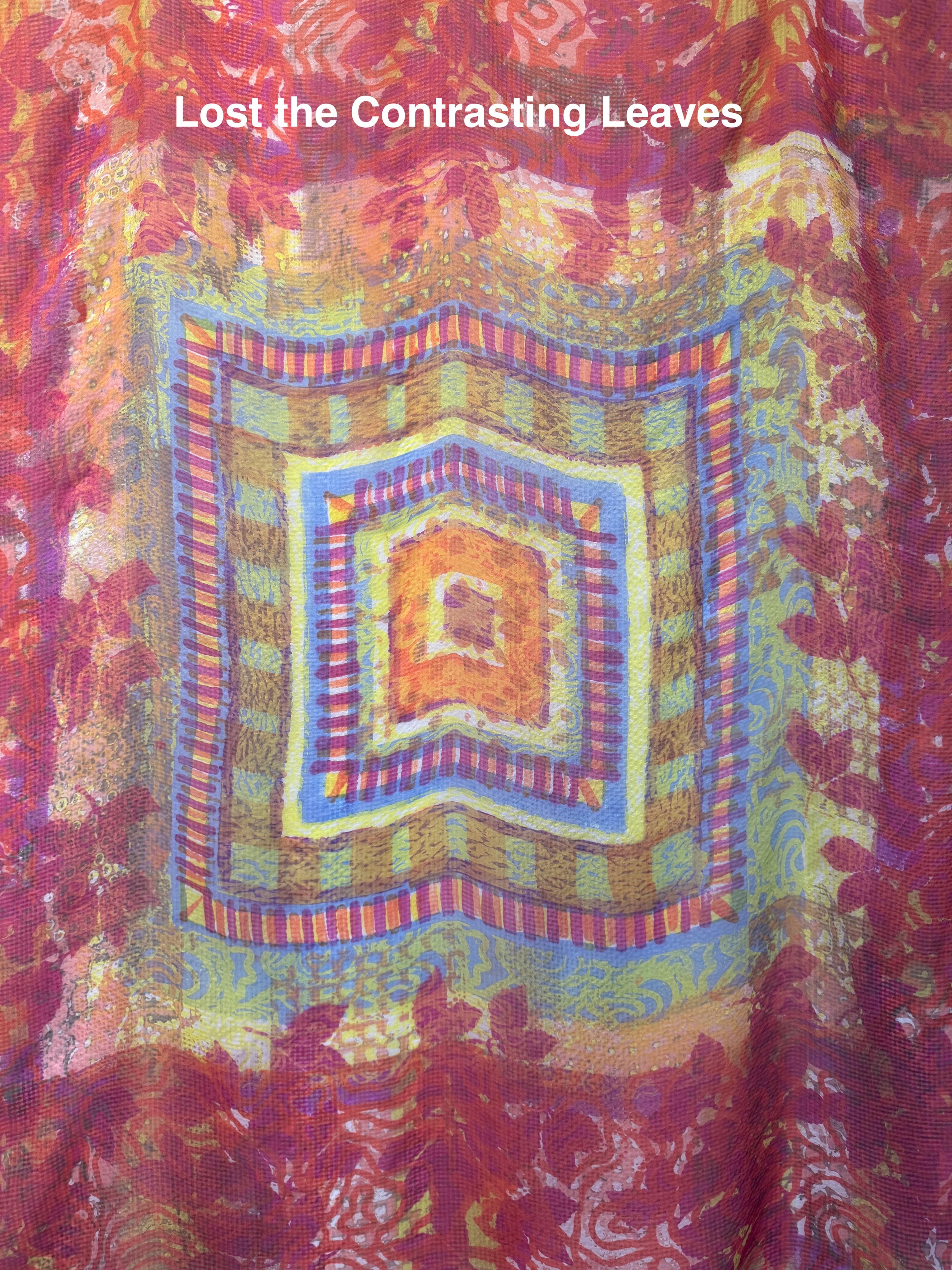

My Fuchsia powdered dye was very old and I think is our main suspect for fugitive color in this piece, despite that I’m still happy with our finished piece